Role & Responsibilites
User Research, UI Design, Testing, Prototyping
Context
A concept project I worked on to solve some UX flaws of Wise and highlight some improvements that may be undertaken in the future. The timeline for this project was 6 weeks.
Tools
Figma, Google form
Maze
Team
Product designer
Project Overview
Money transfer is inevitable in the society and developing a
solution for a smooth digital experience that enables people to
transfer and receive money from friends, family, workplace e.t.c is
necessary to improve people’s lives in the society and the economy’s
GDP. From the UX perspective, it's important to focus on the
end-to-end experience in addition to the business goals
However,
there were some negative feedback regarding the app such as poor
communication channel for complaints and tedious process for
transfer.
So I conducted user research using online survey and reviewing
customer feedback from a relevant review site to gain more insights
and pain-points of the users’ problems.
As a result, I redesigned the app flow of transfer and added a live
chat for users to communicate with the customer service. A similar
redesign flow by WorldRemit led to
6% increase in revenue and higher customer retention rate as
compared to its previous year.
The Proposed timeline for this project was 4 - 6 weeks.
Problem Definition
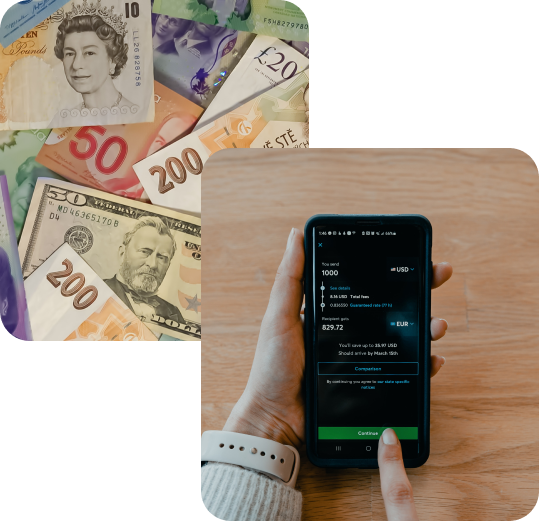
“How might we redesign a better experience for users to send money easily and seamlessly communicate with customer care on the app?”
The goal
1.) Increase Task success rate of transfer
2.) Increase customer’s satisfaction with the product
User Research
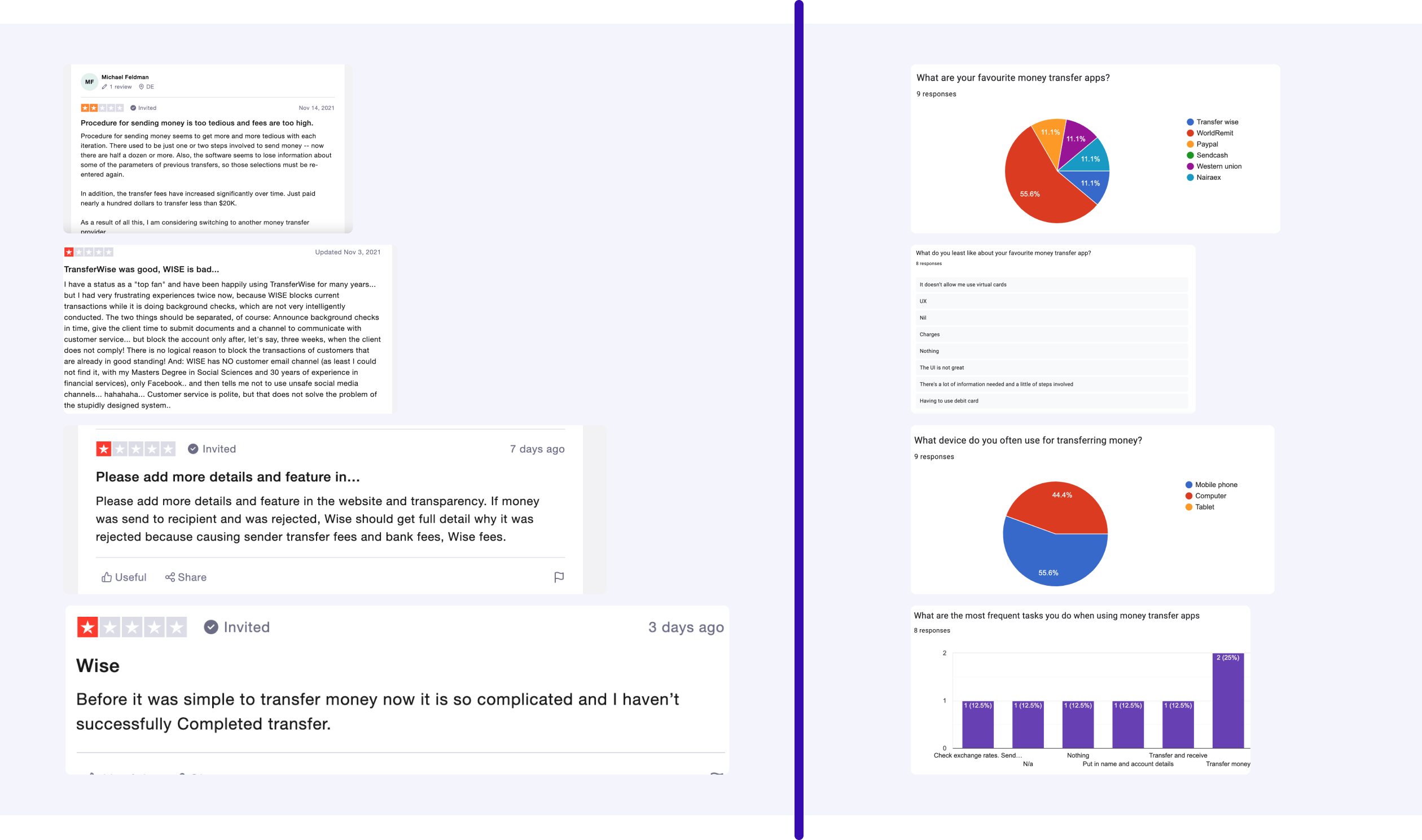
I began my case study by reviewing customer feedback onTrustpilot,
learning about its competitors and customer demographics along
the way.
Customer reviews
On the left, here are some poor reviews regarding the app and challenges users face.
Online survey
On the right, some of the results from the online survey got to further understand user motivation and behavior.
UX Suggestions & Redesign
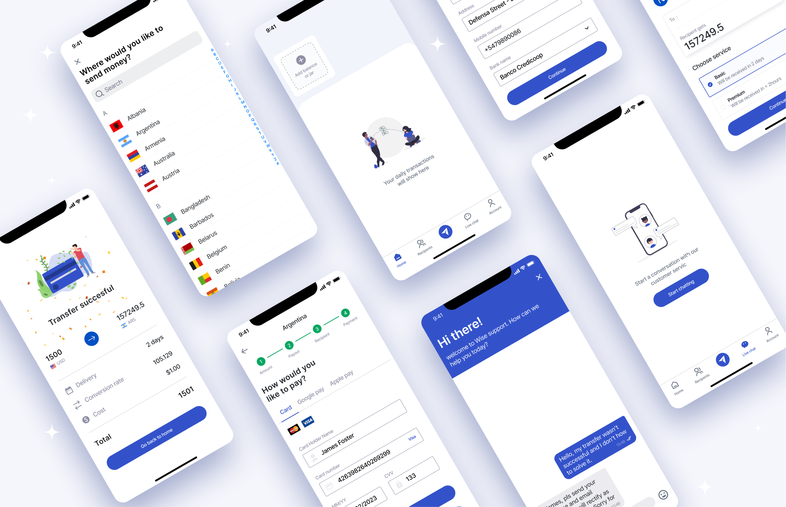
Experience 1: #Home
I improved the information architecture by allowing the profile icon to be seen at the bottom-nav bar and made some adjustments to the color contrast ratio for ease of readability.
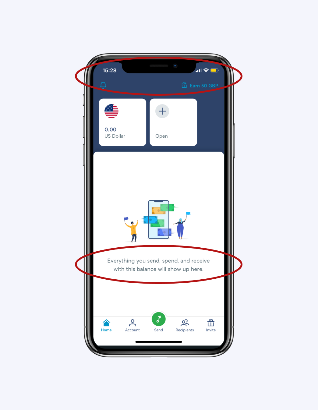
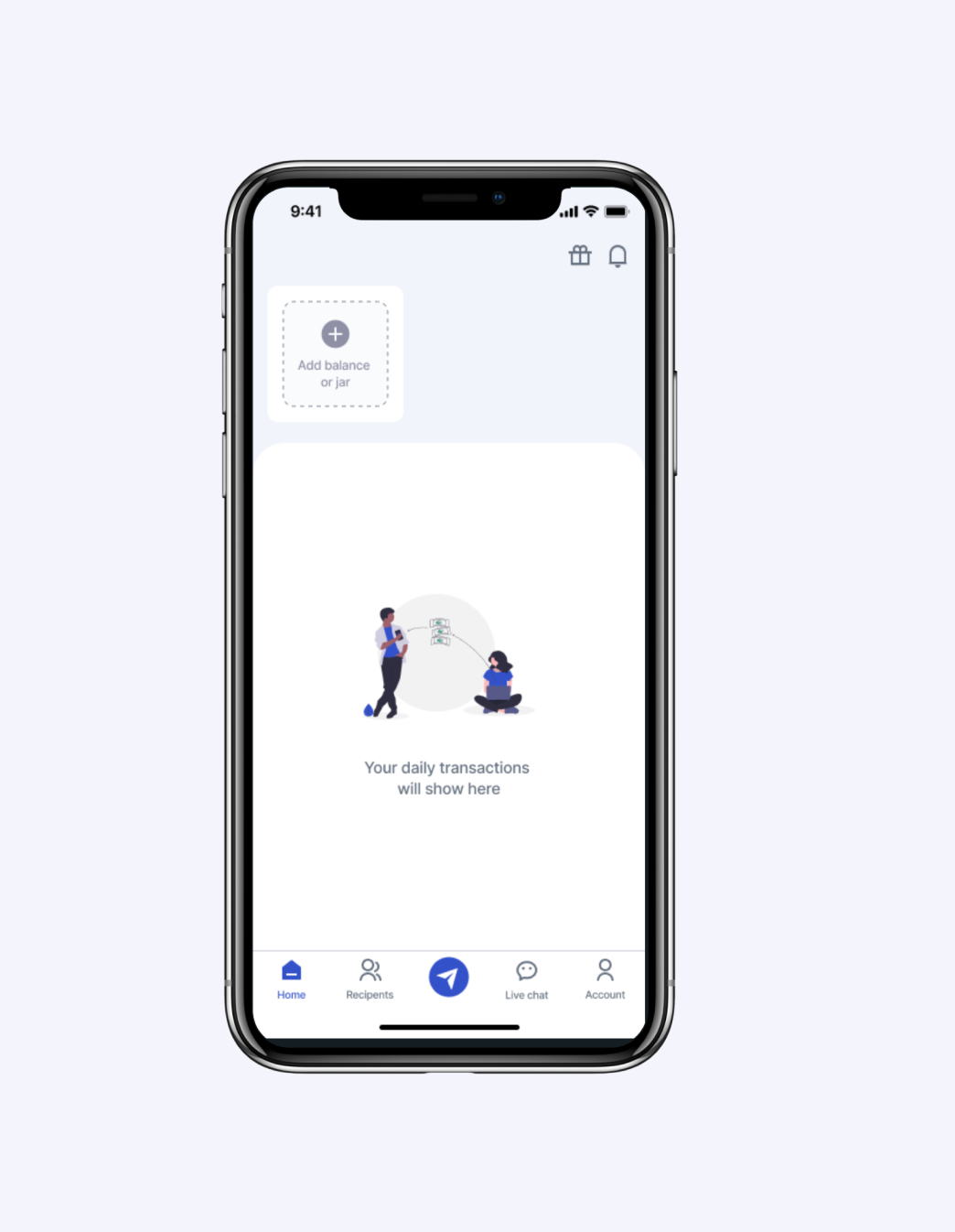
The current home screen has a poor color contrast ratio of about 2.92:1 and the text for empty state is not concise enough
The new home screen was improved by using clear and concise words. The color ratio was improved to 4.51:1
Experience 2: #Transfer
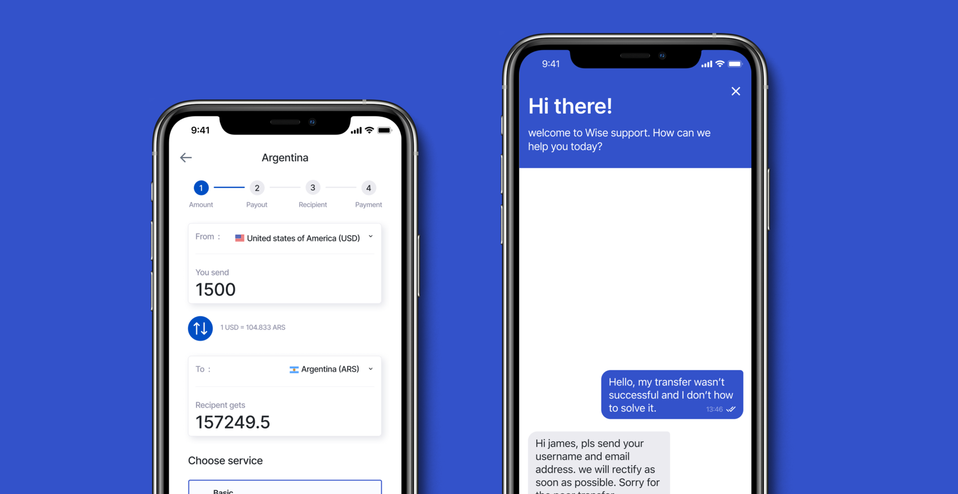
The app flow for transfer involves too many clicks and it is quite ambiguous. The screen was improved by adding a stepper to indicate level of progress of transfer and followed a common UI pattern that users are familar with.
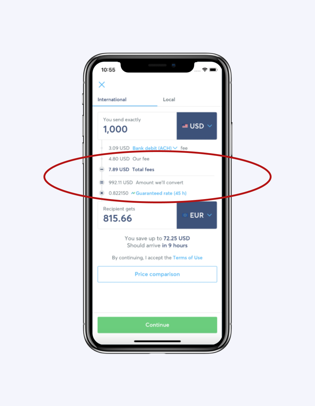
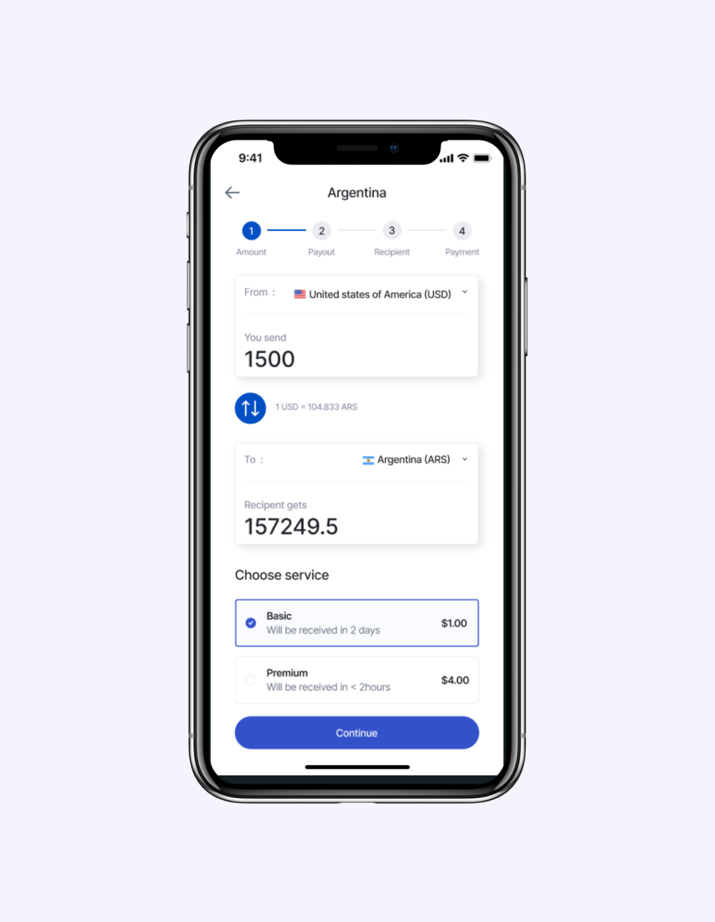
The current transfer screen feels poorly structured and it makes it hard to grasp the details necessary for transfer.
The new screen has a proper structure and the ease of transfer is seamless.
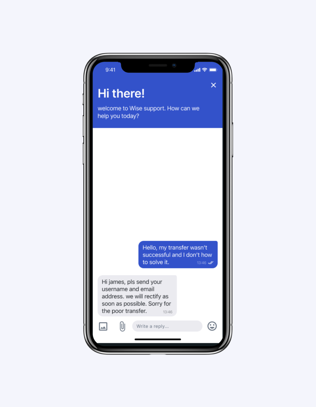
Experience 3: #Live chat
This feature was added to help users contact the customer service for any complaints that may happen and receive response in the shortest time possible.
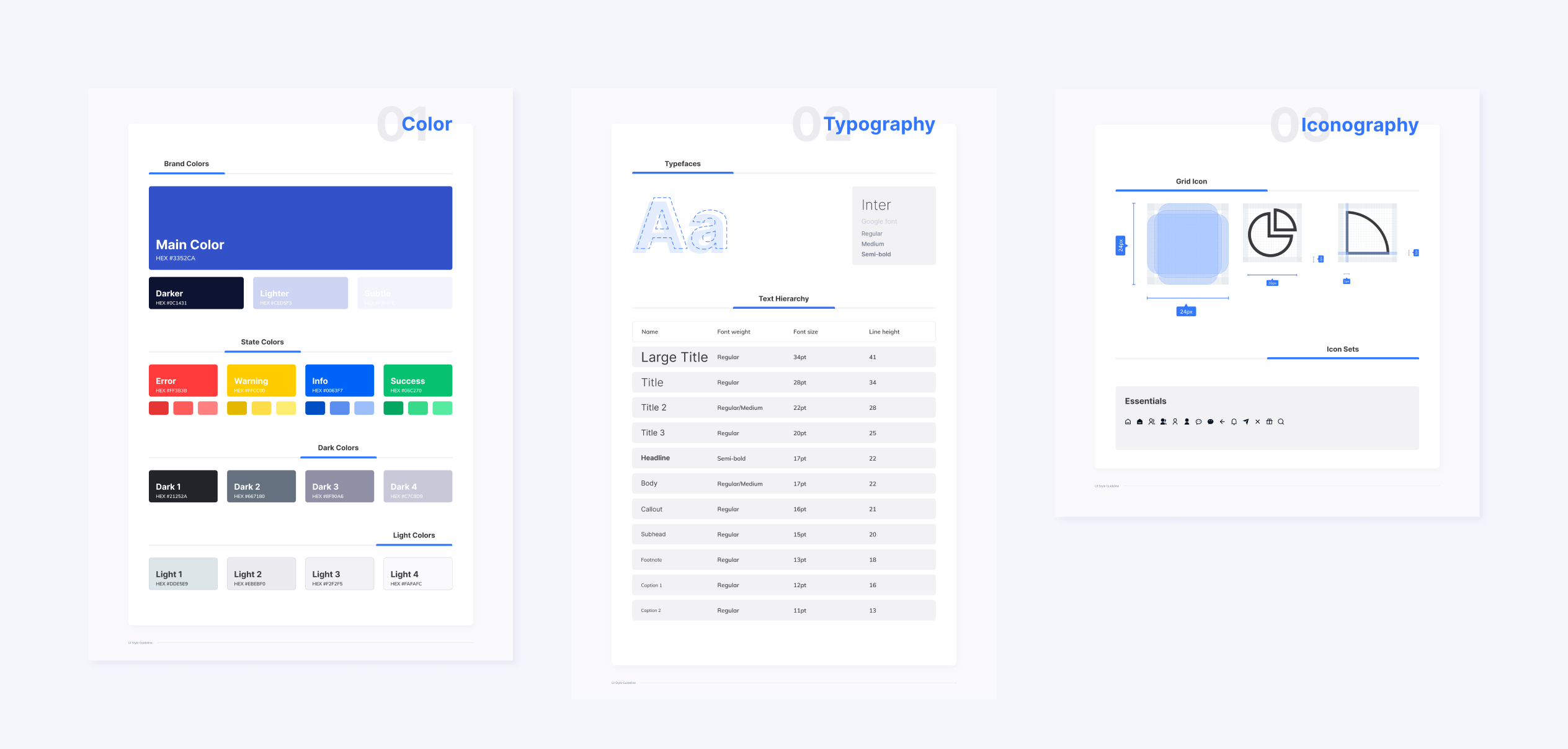
New Visual style guide
Validation testing
To confirm the hypothesis of this solution, the prototype was tested by some of the original participants from the online survey.
Here are some user feedback
about the redesign:
“This is inituitive, I can easily make a transfer”
“Clean and visually appealing”
“I love the interface and it is easy to understand”
Results from the validation testing
The task success rate increased by 100% and overall, users were satisfied with this new solution.
My Learnings
Simplicity is key
A digital product must be simple to use and provide value for the
users as well as the business objectives. Reducing the number of
steps for users to achieve their goal is important for conversion
and user retention.
Research methods can be
less expensive
There are different research methods that can be carried out to
understand user needs and pain points. Some are very expensive
whereas some are cheap that can provide faster solution to the
problem such as competitive analysis, online survey, e.t.c.
Prototyping is important for communication
Effective use of prototyping the screens helps to communicate your
ideas easily to product managers, developers, and users who will
test it.
More Projects
Digital Figures
A Digital and Growth Marketing Agency that offers various services in Google search Ads, SEO, Web development e.t.c.
View Casestudy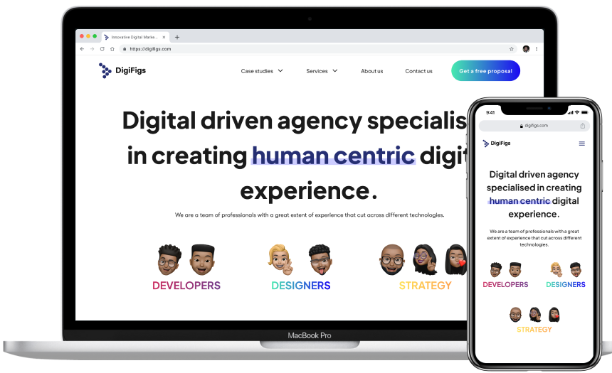
PostPaddy
An app that helps social media managers, influencers create and schedule posts to mutiple social media platforms.
View Casestudy